Logo Clear Space
Maintain clear space around the logo to preserve legibility and visual impact.
A cohesive family of marks that work in harmony across every brand touchpoint.
Each variation serves a specific purpose while keeping the integrity and elegance of the identity.


Inspired by quiet luxury and natural contrast; tones composed for balance, depth, and a timeless beauty that earns its own silence.
Our color palette is inspired by quiet luxury and natural contrast. These tones create a sense of balance, depth and timeless beauty.
Never use pure white or pure black. Pearl ivory replaces white everywhere; deep indigo replaces black.
One dark, one light, one accent — never a tri-color collision. Saturation is the enemy.
No gradients. No glow. No glassmorphism. Restraint is the system.
A refined serif for identity. A clean sans for clarity. A script reserved for one-off signed sign-offs.
A refined serif that expresses elegance, femininity, and timeless luxury. Always letter-spaced; never optically tight.
A clean, modern sans that ensures clarity. Light is the default weight; hierarchy comes from leading and tracking, not bold.
Pinyon Script is reserved for one-off signed sign-offs and the legacy wordmark. Never set body text in script.
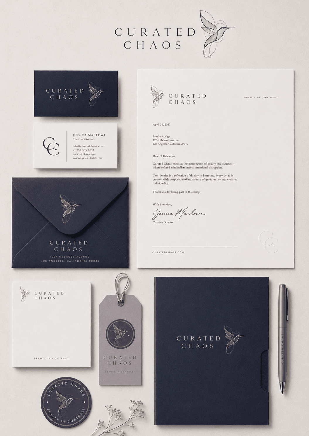
Restraint applied — where the brand breathes across surfaces, scales, and substrates.
Clear application ensures consistency and strengthens recognition. The following examples show how the Curated Chaos identity is used across different formats, scales, and contexts.
Maintain clear space around the logo to preserve legibility and visual impact.
Use monochrome versions when color reproduction is limited. Ensure sufficient contrast.
At small sizes the logo remains legible and simplified — never beneath 12mm.
min 25mm min 20mm
 min 12mm
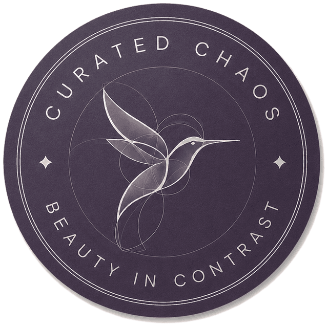
The circular seal carries authority and craftsmanship. Use for embossing, stickers, product seals.
Use the vertical lockup where vertical alignment best suits the format.
Cool, restrained, slightly desaturated. Warm cream, indigo, dried botanicals. No full-bleed photography unless styled in palette.